Archive for the ‘News’ Category

Musical Everett

Monday, July 26th, 2010

Musical Everett

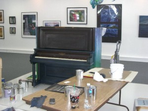
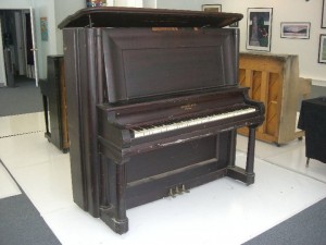
The City of Everett has had a brilliant idea. Carol Thomas the Cultural Arts Manager in the Economic Development group has purchased seven pianos for painting and subsequent distribution/display throughout Downtown Everett. Each piano will be painted by one or two artists and I was selected to be one of the artists! Josie Wise and I are decorating a gorgeous old upright piano that has beautiful sound but started ugly as sin.

Our blank canvas!

Josie and I decided to go with a pacific northwest theme. We are both imports to the Pacific Northwest and as summer swings into gear we are particularly grateful for the natural beauty that surrounds us. In addition, both Josie and I are primarily landscape painters. We enjoy taking brush to canvas or paper and communicating our feelings and impressions of the world to you the viewer. We have decided to take the impressionistic trend and to translate it into a series of paintings on the huge piano. It has been super fun and I’d love to hear your commentary on it!

It started with a steep learning curve for me. The bottom of the piano here really is blue! Josie figured it out faster and her backgrounds are done.

I’ll be updating it as we go along.

Mentioned in Everett Herald

Sunday, July 18th, 2010

On Friday I was mentioned in the Everett Herald as part of my introduction to the new studio! It’s very exciting and hopefully will help generate continued notice of my work in the community.

This is what they said about me; the full article can be found at ‘http://www.heraldnet.com/article/20100716/LIVING/707169981/1025/ENT06#Everett.art.walk.artist.Liz.Lund.heavily.influenced.by.trip.to.Europe’

‘Everett art walk artist Liz Lund heavily influenced by trip to Europe

By Theresa Goffredo
Herald Writer
Liz Lund’s European travels led her to study the impressionists and now she likes to paint large and paint bold.

Lund’s paintings share the walls with artists Janet Wold and Jane Meagher at the Corner Studio & Gallery, 2831 Wetmore Ave., Everett.

The works of those three women and many other artists are among the offerings visitors can see during Everett’s free monthly event, the Everett Art Walk.

The art walk allows visitors into many local art galleries and businesses where they can meet the artists. Free public receptions generally run from 4 to 9 p.m. Saturday.’

Hope you came by the studio last night but if not I’ll be at the Studio this monday and wednesday and thursday.

Liz

Sunflowers-Yippee!

Tuesday, July 6th, 2010

I’ve been transitioning into more and more acrylic paintings lately and really love working in this medium. First, it’s super fun to create something that is hardy and light fast. I love the flow and mixture of watercolor but it’s such a fragile medium for display. In the midst of this transition I was working in my old studio and staring at a really fun piece of work created by Marc Lucero. This bright cheery sunflower on a smooth wood panel was hanging over my work table and taunting me with it’s fun vibrant colors on wood paneling. I thought to myself… I can make something fun and vibrant with acrylic… So I did.

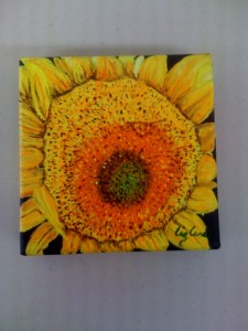
I decided to take the inspiration and go with a small sunflower series. Each piece is 5in x 5in square canvas painting. I originally planned for something simple and without much texture but the paintings just didn’t work out as planned. The first piece is a closeup of the center of a sunflower. I did a layered series of dots for the center portion and I love the look of it. I also went with a painterly approach to the petals of the flower, meaning each petal is a layered piece showing depth and movement. It was a ton of fun… a little more work than I’d planned but I like the end result.

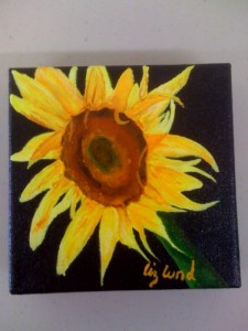
The second piece was a piece showing the whole flower. I originally did the background for this piece as white but hated the look so I painted the background black. The black really brought out the fun vibrancy of the sunflower look. This piece isn’t as detailed as the closeup piece but is fun in it’s own way. It’s more impressionistic in style.

The third piece is coming and not finished yet…. I’ll post it when it is.
I’d love to hear what you think!

Moving to a new studio

Thursday, June 10th, 2010

After a successful year full of adventures, successes, great decisions bad decisions and all levels of fun I am leaving my studio on Colby Ave.  It has been a wonderful experience and a successful one!  I’ve learned so much about owning and operating my own store, how to sell artwork.   What kind of artwork sells and what doesn’t.  As it turns out I have no idea what will sell!  I love all my patrons the friends I’ve made and the good times I’ve had.  I can’t wait to continue them all at the corner studio.  It is on the corner of Wetmore and Hewitt in downtown Hewitt.  Janet Wold and Jane Steele-Meagher have been operating a wonderful studio gallery and asked me to join them.  At the end of June I am moving to join them.  I can’t wait to work with such talented and interesting artists and I can’t wait to see what new work they inspire!

A change of perspective

Wednesday, May 19th, 2010

Every now and then you have to change your perspective on life and art.  In the past I’ve spent a lot of time painting large and thoroughly enjoy the loose expressionist style enabled by large format paintings… but then I found these really adorable tiny canvases.  They’re one inch by one inch.  In discussions with my mom, a fellow artist, she how a change in perspective can help one’s work.  I thought why not, they have these mini canvases on sale and they’re super cute… I loved it! They are so much fun to make and I’d encourage anyone to give miniatures a shot. Just get a small brush. I think that with a small brush you can still achieve an impressionistic style and a loose look but just tiny.

here’s a wee photo of my work:

Baby gifts and Sweet Thoughts

Tuesday, May 18th, 2010

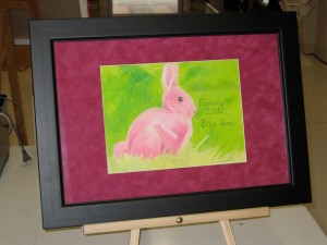
These days all my friends seem to be creating new life and I always struggle to find unique and original gifts. One of my dearest friends and her husband (yep the guy even married my husband and me!) recently had an adorable baby girl. I wanted to do something special and meaningful but struggled to find the right gift. I decided to create something similar to what my parents were given when I was born. A family friend gave my parents a very sweet embroidered piece with an image, my name, pounds and date. I don’t sew but I do know how to create artwork, so I spent some time researching options. I decided to go realistic… sort of. I wanted something sweet so I opted to use a bunny as an image. I spent a good deal of time online looking at bunny photos and learning how bunnies are shaped. Once I got comfortable with the shape I decided to work in colored pencils, they’re fun celebrate childhood and I have been missing them as a medium. So I drew a bunny in colored pencil and then added in the information for the sweet baby girl. That being said I had to celebrate the girlyness of it all so I changed the bunny to a pink one!


I’ve blurred out the baby’s name but the rest of it is true. In this case I’ve added a basic frame and some very fun mat board to the piece.

In the future I plan to take high resolution photos of the pieces before I add in personal information and use the images to create prints. The prints will allow me to put in nice font names and such but it’s a print so a bit less personal. I’d love to hear what you think! The next creature will be a frog… I’m collecting frog photos 🙂 Cool frog photos anyone?

Easter and Eggs

Sunday, March 28th, 2010

Da Eggs:
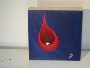
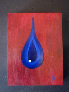
How appropriate for Easter! I have created several pieces inspired by friends who are either preggers or gave birth recently.  I’m attaching photos of the first two in the three piece series.  The third piece isn’t done yet!  These pieces are all based on the egg and the womb.  I do have to say that despite all of the symbolism behind the pieces they were fun to paint.  I worked to achieve the smooth look of the womb/sac space and to achieve a smooth flow of color.  It was a lot of fun to make these pieces. They are abstract and representational and way cool looking if I do say so myself! What symbolism do you see?

IMG_2656This piece I find interesting in the composition.  I tried to create a happy and interesting visual space.  You can see the red comforting space cradling the egg and it’s all surrounded by a peaceful blue.   Throughout the blue space you see lots of movement and flow and the red space is warm and comforting.
IMG_2679

I wanted a little more aggressive of color choices in this one.  I do feel as if the red background is much less soothing.   That being said, upon review I do believe that this piece requires some additional working.   I think that the blue sac is not finished.    I’ll rework it and post it here along with the third piece later this week.

I’d love to hear your reactions.

New Oil Paintings! yippee

Monday, March 22nd, 2010

Fun with Oil Paintings

Under normal circumstances I describe myself as a watercolor artist but in the last couple of weeks I have been drawn to painting with oils and acrylics.  I have had a blast and learned several things about my style of painting.  Apparently, no matter the medium I still think like a watercolor artist.  I guess that isn’t a shocker since I was trained to be a watercolor artist.   That being said… I am loving the gushiness and the flow of these new mediums.

Oil:

I have created two pieces in oil that I think are interesting and fun.

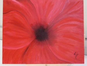
Red Flower in Oil

Red Flower in Oil

This is the first piece a red flower that is full of gushiness and flowing colors.  I have noticed that I prefer to paint with just oil paint and linseed oil… it creates a really cool flowing effect… however it takes forever to dry!  In this piece I worked to create a vibrancy and flow but to still retain the overall shape of the center flower.  I think I did an ok job.. at the very least while painting it I had 7 people walk into the studio to see the new painting.  I think it’d be very fun to try a different flower and try to achieve the smooth flow but to do it in watercolor.   What do you think?

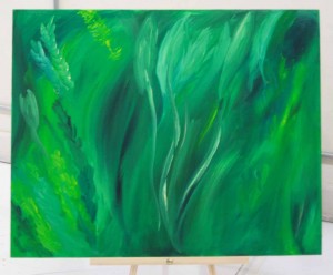
sea grass

The second piece is all green motion.  The piece was originally inspired by the background grasses in a photo… but somehow I never got to the flower part.  I had so much fun creating the flow of color and movement in this piece.  As with many of my more inspirational pieces I think this one is from the heart.  I can’t tell you what I was thinking as I created it or even what color combinations I used.  In looking back at it I can tell you that I used green 😉 but not much else.

I hope you enjoy these and I welcome comments or critiques on the pieces.

Liz Geiger Studios is in Everett’s Blog!

Thursday, March 18th, 2010

Hello all friends one of my favorite paintings is featured in Everett’s blog. check out the blog for any upcoming events and opportunities in the Everett Area. www.everettwablog.com! Also tomorrow I’ll be updating the blog with a bunch of new photos of oils, acrylics and a few cave like paintings. Stay tuned!

Pretty Art vs. Edgy Art

Tuesday, March 16th, 2010

Pretty Art vs. Edgy Art

I have been thinking about this topic for a while now and decided it was time to start a conversation.  I’ve stated openly that I enjoy creating ‘pretty’ artwork.  My theory has been that there is enough ugliness and harshness in this world and I feel no need to create more or to create something that reminds us of these tough times.  Maybe that is too simplistic or maybe it’s not respected enough and I should shut up (not that this is likely to happen!).  To set the scene let me build two descriptions and please note that I am not trying to put anyone in a category or to debate skill as I think we are each unique and skilled in our own ways.

Pretty Art:

It’s such a simple name but often landscape artwork is placed in the category of ‘pretty’ artwork.  It can be and often is soothing or passionate in a detached way.  Meaning landscape artwork will rarely challenge you to think about life in new ways or will evoke disturbing and uncomfortable emotions.  The artist may be expressing uncomfortable emotions or working out the technical challenge of creating a certain feel through new techniques but it is rare that the viewer sees it.  For example take Monet’s waterlilies,  they are stunning with exquisite composition and are a real pleasure to just look at.  Granted the waterlilies are done by a master but these pieces have depth and skill that is wonderful to view from an artist’s perspective.  Yet, few people who don’t study and love art will ever see anything other than a pretty painting.  And that is ok.  Without a doubt they are pretty paintings but they are so much more.  I would argue that most landscape paintings are more than just pretty, they often have thought provoking questions buried in the technique or the color choices or … pick a part of the painting and a question and see what you can find?  That being said there are definitely paintings that I have finished just ’cause it was fun or because I thought it’d look neat.  But.. often those are the paintings I created during difficult times in my life.  Times when my artwork was created as an escape.  I don’t know if my inner angst worked it’s way through the paintbrush or not and if it did I’m not sure I’d share my very private inner angst with the world and tell you what caused me to select that shade of red to paint over the church.  Maybe when I’m long gone someone will study my work, look through my life and say… oooh that’s why she did this.  In the interim I’m content if I can make art that fills my heart and hopefully will help someone else remember peace on a bad day.

Edgy art  or Art for other Artists:

Before I get into this, let me state that I really appreciate this kind of artwork.   It has so much value in our artworld and much of it’s value is not quantifiable.  Without people willing to push the boundaries, we would never have the impressionists or Picasso or heck anyone other than Greek sculptors.   That being said, some of the artwork is wonderful to look at and some is much harder.  I’ve seen brilliant pieces discussing the role of Jesus in our lives or a cardboard sculpture highlighting the great garbage patch.  These pieces are great pieces designed to remind us to think, not to just feel or to close our eyes to pain or responsibility but to think, a much harder goal.  I enjoy that these pieces successfully remind us of our responsibility.  Just as I truly enjoy that Picasso brought forth a new way of painting.  Do I visually enjoy looking at Picasso or a piece depicting Christ arched in pain over an eagle… no not really.  Do I want to live with them in my house.. nope I sure don’t.  BUT I respect an artist who can create such things, who can put a piece of their heart and soul into a visual expression for the world to see.  This art is awesome and can change the world… but so can pretty artwork.

I started this post as a defense and a hopefully a discussion of types of artwork and I would welcome your thoughts or comments.   I have seen that many people look at pretty work and think less of it than the edgy work out there.  I would argue that both have value and to only see edgy work as valuable or to only see pretty work as valuable is missing out on so much wonderful art.

So the next time you look at a piece of artwork I would pose this question for you.  If it’s something that is just  pretty… is pretty all there is to this painting?  or.. if the piece is uncomfortable to look at because of the emotions… I would ask how did the artist convey this emotion?  Did they use attractive or fun methods to do so?  There is value in all forms of artwork… let us be great and ask ourselves to look for the value in the forms and enjoy all aspects.